Garment and Artwork Colorway Planning
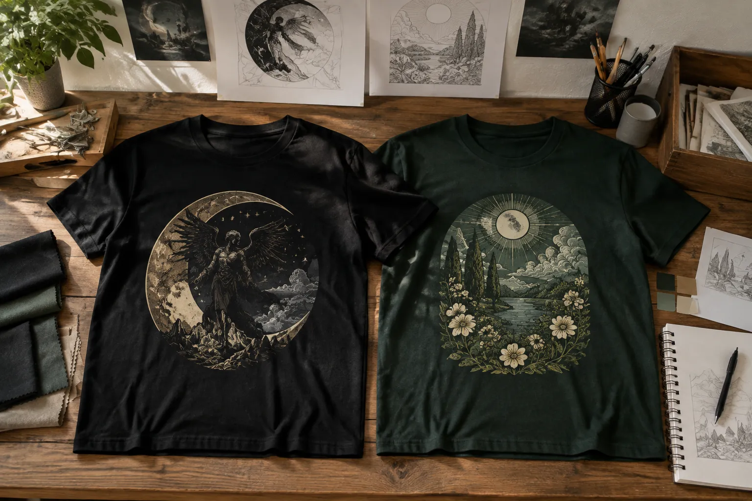
Choosing among t shirt color combinations is a collection decision, not a search for one universally correct pairing. The same artwork may read clearly on a black shirt, lose detail on dark green, or become intentionally subdued on olive. Garment tone, artwork value, line weight, placement, viewing distance, decoration method, and launch context all change the comparison.
Keep three states separate throughout the process:
- Visual intent: how the colorway is meant to read in a concept preview.
- Provider fit: whether the artwork and garment combination fits the selected provider's template and file workflow.
- Physical appearance: what remains to be confirmed through sampling or direct production guidance.
A simulated mockup supports the first decision. It does not establish the second or third.
Start With Consistent Review Conditions
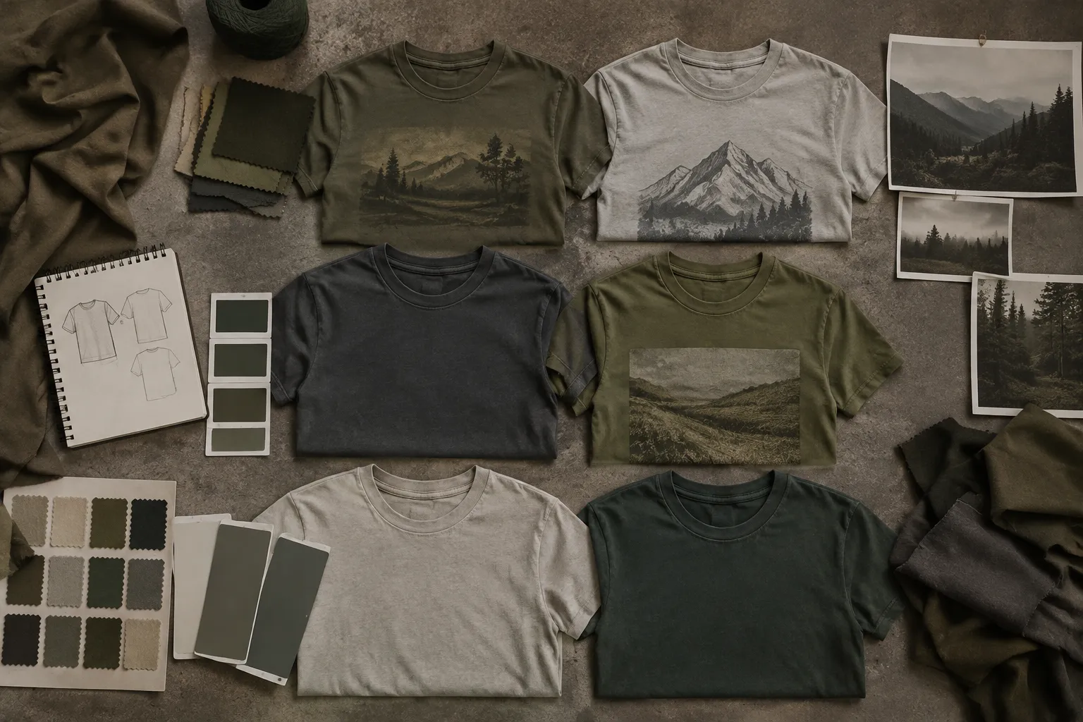
Colorway comparisons become unreliable when each candidate uses a different crop, garment shape, artwork scale, or viewing condition. Hold those variables steady before judging the palette.
Record the following for every candidate:
- Garment tone and approximate value
- Garment fiber or material, when known
- Artwork colors and transparency
- Print area and placement
- Graphic scale and line weight
- Decoration method
- Listing frame and campaign context
- Viewing size and distance
- Evidence state: intended, simulated, provider-confirmed, sampled, approved, or produced
The garment is part of the colorway. A cream shirt may act as the light field around a line illustration, while a black shirt may supply the deepest value in a limited palette. Using the garment as part of the composition may reduce unnecessary background ink, but the result still depends on the artwork, decoration method, and provider workflow.
Compare Garment Tone and Artwork Contrast
Contrast describes the visible difference between adjacent tones or colors. Value describes the lightness or darkness of a color. A pairing can differ strongly in hue while remaining close in value, leaving text or thin line work difficult to separate from the garment.
Use contrast as a review criterion rather than a verdict. Begin with the visible read:
- Does the main graphic separate from the garment at thumbnail size?
- Do small text elements remain distinct?
- Do thin outlines retain their shape?
- Does the neckline interfere with the graphic?
- Does the placement leave enough surrounding space?
- Does the artwork read from the planned viewing distance?
- Does the garment become a useful palette color or an accidental gap?
High-Contrast Routes
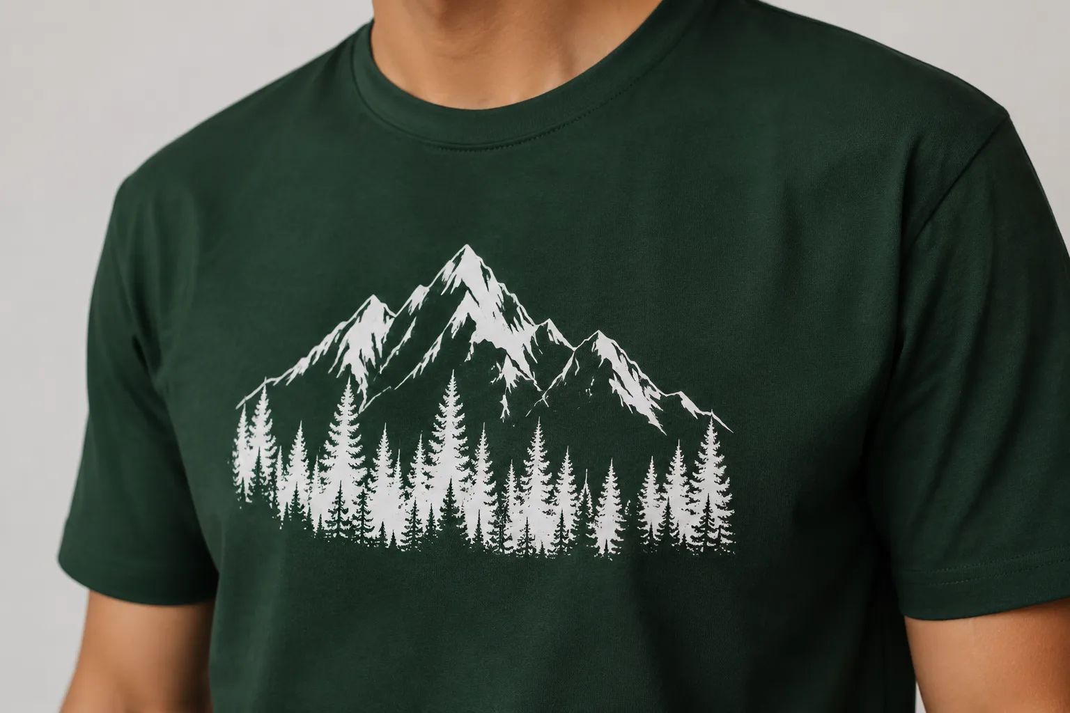
High contrast may suit bold lettering, compact marks, small internal details, or graphics intended to read quickly in a listing frame. Common concept examples include white artwork on a black shirt, white artwork on a dark green shirt, pale yellow artwork on deep blue, and black artwork on a light gray or white shirt.
These pairings remain conditional. Exact garment tone, graphic proportions, transparency, lighting, and decoration method can change how much separation survives on fabric.
White on black often appears distinct in a digital preview. White on dark green may also separate clearly, but the result depends on the specific green, the artwork structure, and the provider's handling of the design on a dark garment. A large solid illustration can tolerate a different relationship than a small wordmark, so assess them separately.
Tonal Routes
Tonal t shirt colorways use related hues or values to create a quieter relationship between garment and artwork. Gray on olive, muted green on forest, or navy on dark blue may support a restrained collection direction when the graphic is large enough to retain its main shapes.
Tonal does not mean automatically weak. It changes the priority of the assessment. Check whether the silhouette remains visible, whether major shapes separate, whether the graphic depends on fine internal details, and whether the same treatment holds across the full graphic set.
A large illustrative graphic may survive gray on olive because its shapes carry the composition. Small text or narrow lines may lose contrast on the same garment. The route is intentional only when the team records why reduced separation is acceptable.

Use Near-Match Pairings as Diagnostic Cases
Near-match combinations show where a palette relationship can stop carrying information. Examples include navy artwork on a dark blue shirt, red artwork on maroon, light gray artwork on white, dark navy artwork on black, and gray artwork on olive or forest.
These are not universal failure thresholds. They are prompts for a closer pass, especially when the graphic contains small lettering, thin outlines, closely spaced shapes, detailed line work, low-area marks near the neckline, or transparent sections that allow the garment tone to influence the artwork.
A grayscale view can reveal whether the garment and artwork occupy nearly the same value range. It cannot replace a garment preview or physical sample, but it can identify a candidate that needs revision before provider questions are escalated.
Choose the revision according to the observed failure:
- Increase the artwork's value difference when the graphic merges with the garment.
- Thicken fine lines when their shape disappears at smaller sizes.
- Enlarge small text when the intended viewing distance reduces separation.
- Remove low-value internal details when they do not survive the garment read.
- Add a controlled outline when the main forms need a clearer boundary.
- Move the graphic when the neckline or another placement feature interrupts it.
- Reserve the tonal treatment for larger artwork when small details remain unresolved.
A weak thumbnail read usually calls for artwork or scale revision before production questions are escalated. Record the visible consequence rather than only writing that the option “feels off.”
Use Color Relationships to Generate Routes
Terms such as complementary, analogous, and tonal describe palette relationships. They help generate candidates, but they do not establish readability, print behavior, audience response, or sales performance.
Complementary Colorways
Complementary colors sit opposite one another in common color-wheel models. Orange and blue or yellow and purple are familiar examples. The relationship may create visible separation and energy, but similar values or excessive saturation can still produce a weak garment read.
Check hue difference, value difference, saturation, artwork-to-garment area ratio, and the role of the color in text, outlines, or large shapes. A complementary relationship is a candidate-generation tool, not a production decision.
Analogous Colorways
Analogous colors sit near one another in a color-wheel model. Blue, blue-green, and green can form one route; red, red-orange, and orange can form another.
These relationships may help a collection feel connected. They can also reduce separation when the garment and artwork occupy similar values. Use the relationship for palette exploration, then inspect the actual garment tone, graphic structure, placement, and viewing size.
An analogous route may suit a large graphic with clear shape boundaries. Small text and narrow line work may need a stronger value difference within the same family.
Tonal Colorways
Tonal planning keeps the garment and artwork within a closely related color family. A collection board may show the direction as controlled and quiet, but its practical read depends heavily on graphic structure and viewing context.
Do not treat tonal planning as a simple low-contrast version of a high-contrast route. The team may be choosing subtlety, using the garment as part of the composition, or reserving emphasis for another colorway in the set. Record that purpose alongside the candidate.
Review Dark Garment Colorways Separately
Dark garments introduce production questions that a front-facing mockup may conceal. Transparency, underbase behavior, ink coverage, and decoration method can affect how artwork appears against the garment.
Printful's file-preparation guidance describes provider-specific considerations for transparency, dark-garment underbases, print areas, and image resolution. Its examples include a 12 by 16 inch print area and 150 to 300 DPI guidance for relevant products and workflows. Those details belong to that provider's documentation and should not be generalized to every printer, garment, or decoration method.
For a dark garment review, record whether the artwork contains transparent areas, whether an underbase is expected, which colors must remain distinct, whether subtle shadows or low-opacity elements are present, which print area applies, which resolution range the provider requests, and which questions remain unanswered in the provider template.
A dark-garment preview shows intended composition. It cannot confirm how fabric, ink, underbase, or lighting will affect the produced piece.
Keep Artwork and Listing Assets Separate
The artwork file and the listing frame serve different purposes. The artwork file carries production information such as transparency, resolution, color data, and placement boundaries. The listing frame carries presentation information such as crop, garment visibility, scale, and surrounding context.
Artwork Review
- Transparent background behavior
- Artwork dimensions
- Print-area alignment
- Small text and fine lines
- Colorway naming
- Version control
- Provider template fit
- Open production questions
Listing Frame Review
- Thumbnail readability
- Garment tone within the simulated preview
- Graphic visibility at the intended crop
- Neckline and chest placement
- Consistency across the graphic set
- Appearance in campaign assets
- Clear labeling as a simulated mockup
A listing frame may appear balanced because the display emits light and the composition is carefully presented. Fabric reflects or absorbs light differently. The frame therefore supports presentation review, not production confirmation.
Apply Digital Contrast Checks Within Their Scope
WCAG 2.2 provides contrast terminology and thresholds for digital foreground and background content. That vocabulary can organize a review of mockups, listing frames, and campaign assets.
It does not validate textile contrast, ink opacity, fabric texture, lighting on a produced garment, color fidelity, wash durability, print quality, or provider acceptance. A digital pass can identify a weak listing frame, but it cannot substitute for provider confirmation or a physical sample.
| Review area | What it can show | What remains unconfirmed |
|---|---|---|
| Digital contrast pass | Separation within a mockup or campaign asset | Textile and ink behavior |
| Garment preview | Intended placement and collection appearance | Physical color and surface interaction |
| Provider template | File and print-area requirements for that workflow | Results outside the stated workflow |
| Physical sample | Observed appearance under the sample conditions | Results across every garment, light, or production run |
Carry the evidence state with each asset. “Provider-confirmed” and “sampled” are different records: provider documentation describes a workflow or requirement, while a physical sample records an observed result under specific conditions. Neither state should be silently upgraded to approved or produced.
Compare Colorways in the Launch Context
A colorway can read differently in a product listing, campaign crop, and collection board. Compare each candidate in the same contexts and change one variable at a time.
- Place every candidate on the same garment silhouette.
- Keep artwork scale and placement fixed.
- Check the full garment view.
- Check the intended listing frame.
- Crop each option to thumbnail size.
- Review campaign assets with the same background and lighting.
- Inspect the neckline, chest, back, or sleeve relationship.
- Record the first visible failure and the next revision action.
Useful observations are specific:
- The small text loses contrast at thumbnail size.
- The graphic sits too close to the neckline.
- The dark artwork merges with the garment.
- The colorway breaks the shared palette of the graphic set.
- The campaign crop removes the strongest contrast area.
- The simulated mockup remains clear, but physical interaction is unconfirmed.
This record converts a subjective reaction into a decision another reviewer can inspect.
Build a Colorway Decision Record
A short source record keeps the decision attached to the next collection stage.
| Field | Example entry |
|---|---|
| Colorway name | Dark Green / Warm White |
| Garment tone | Dark green; exact product shade remains to be confirmed |
| Artwork colors | Warm white and muted gold |
| Placement | Center chest at a fixed graphic scale |
| Print area | Provider template required |
| Decoration method | Remains unconfirmed |
| Transparency | Open question for interior artwork areas |
| Underbase | Confirm with the provider for the dark garment |
| Viewing checks | Full view, thumbnail, listing frame, and campaign crop |
| Observed issue | Thin secondary line weakens at thumbnail size |
| Evidence state | Simulated mockup |
| Next action | Thicken the secondary line and request provider confirmation |
| Sampling need | Required if exact garment interaction matters |
Keep “team preference” separate from “observed.” A preference guides the collection direction; an observation describes what appeared under stated review conditions.
Know When the Mockup Is Insufficient
Move beyond the mockup when the decision depends on details a display cannot establish. Physical sampling or direct provider confirmation becomes relevant when exact color appearance matters, transparent artwork overlaps a dark garment, an underbase may change the relationship, or thin lines and small text carry essential information.
The same applies when fabric texture may affect the graphic, placement approaches a template boundary, lighting changes the perceived separation, several decoration methods remain possible, or the colorway will anchor a coordinated graphic set.
Label a physical sample and tie it to its conditions. Record the garment, artwork version, placement, lighting, decoration method, and observed result. One sample describes that sample; it does not establish behavior across every product or workflow.
Common Misreadings in T Shirt Color Combinations
“Complementary means readable.”
Complementary relationships can create strong hue separation, but readability also depends on value, saturation, scale, line weight, and placement.
“White on black is always the answer.”
White on black may provide a clear visual route for some graphics. It can also change collection balance, expose transparency questions, or make certain details appear too sharp in a campaign frame.
“A screen preview proves the garment result.”
A simulated mockup represents intended appearance within a display. It does not establish physical color, fabric interaction, ink behavior, or manufacturing outcome.
“CMYK conversion confirms the final color.”
Color preparation can support a file workflow. It does not establish the physical result across materials, lighting conditions, decoration methods, or providers.
“The garment tone is only a background.”
The garment can be an active color in the artwork palette. Treating it as part of the composition may reduce unnecessary ink and create a more integrated graphic, while the interaction still requires appropriate review.
Handoff to the Next Collection Stage
Colorway planning is ready for the next stage when the team can explain the choice and identify its remaining dependencies. The handoff should include:
- Selected and rejected colorway candidates
- Garment tone and material information
- Artwork colors, transparency, and version
- Placement and print area
- Decoration method
- Listing and campaign review states
- Provider template and underbase questions
- Resolution and file-workflow notes
- Lighting and viewing conditions
- Physical sample requirement
- Evidence state for every visual asset
- Responsible party for the next confirmation
The next action may be artwork revision, provider review, sampling, listing preparation, or a rights and usage check handled by the responsible party. The color comparison should leave those dependencies visible rather than implying that a visual preview has resolved them.
Proceed with the dark green and warm white concept preview for collection review; revise the secondary line, confirm the provider template and underbase behavior, then assess a physical sample before treating the colorway as approved.
Sources
- How to prepare the perfect print file | Printful
- Web Content Accessibility Guidelines (WCAG) 2.2
- Consumer Response to Design Elements within Digitally Printed Apparel Products
- Consumer Perception on Inkjet Printed Textiles
- Towards a Universal Understanding of Color Harmony: Fuzzy Approach
- Comparison of Evaluation of T-shirts between Japanese and Chinese based on Hierarchical Kansei Model