Apparel Graphic Placement and Colorway Planning
A t-shirt collection can look coherent in a design file and lose its balance when the artwork moves across garment sizes, silhouettes, tones, or listing images. The central planning task is to compare placement, scale, garment fit, garment tone, and artwork colorway together before sampling or production confirmation.
Start with one named garment, one artwork concept, and one intended use. Record the planned placement, approximate scale, garment type, garment tone, artwork colorway, viewing context, and current confirmation state. That record turns a preference into a brief another person can review.
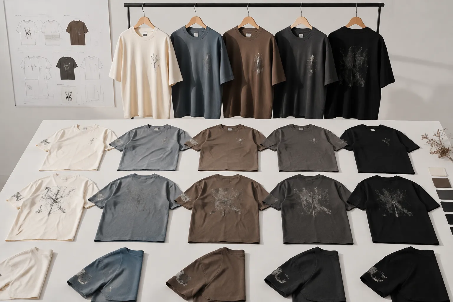
The Planning Territory
Placement and colorway decisions depend on one another. A graphic that reads clearly on a light center chest may need a different artwork version on a dark full-back garment. A compact sleeve mark may suit a standard T-shirt but need a new proportion on a hoodie or tank.
| Decision area | What to compare | What it supports |
|---|---|---|
| Collection role | Primary graphic, supporting identifier, repeatable mark, or collection accent | The visual priority of each placement |
| Garment area | Chest, front, back, sleeve, nape, hemline, inside neck, or all-over surface | The placement route to review |
| Garment geometry | Cut, size range, collar, sleeve width, pocket, seams, and available panel | Whether the same artwork can transfer cleanly |
| Graphic scale | Artwork proportion, smallest text, thinnest line, and garment coverage | Whether the design remains balanced on the smallest planned garment |
| Garment tone | Fabric color, artwork version, contrast, and fine-detail separation | Whether a revised or reversed colorway needs review |
| Presentation context | Worn view, listing frame, thumbnail, campaign crop, or flat view | Whether the design reads in its intended asset |
| Confirmation state | Intended, simulated, template-checked, sampled, approved, or produced | What can be decided now and what remains open |
These are separate fields, but they should remain connected in the decision record. The same nominal graphic width can create different visual weight on a fitted, relaxed, or boxy garment.
Choose a Placement Route
Placement labels provide useful shared vocabulary. They do not create universal dimensions or production rules. Compare each route against the graphic's role, garment geometry, size range, collar or seam relationship, and intended viewing context.
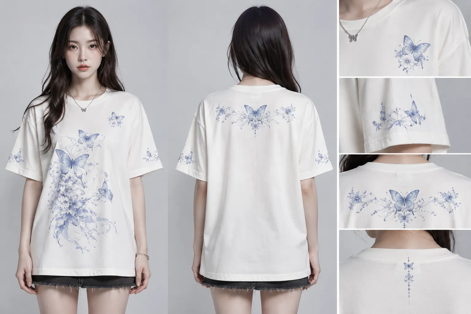
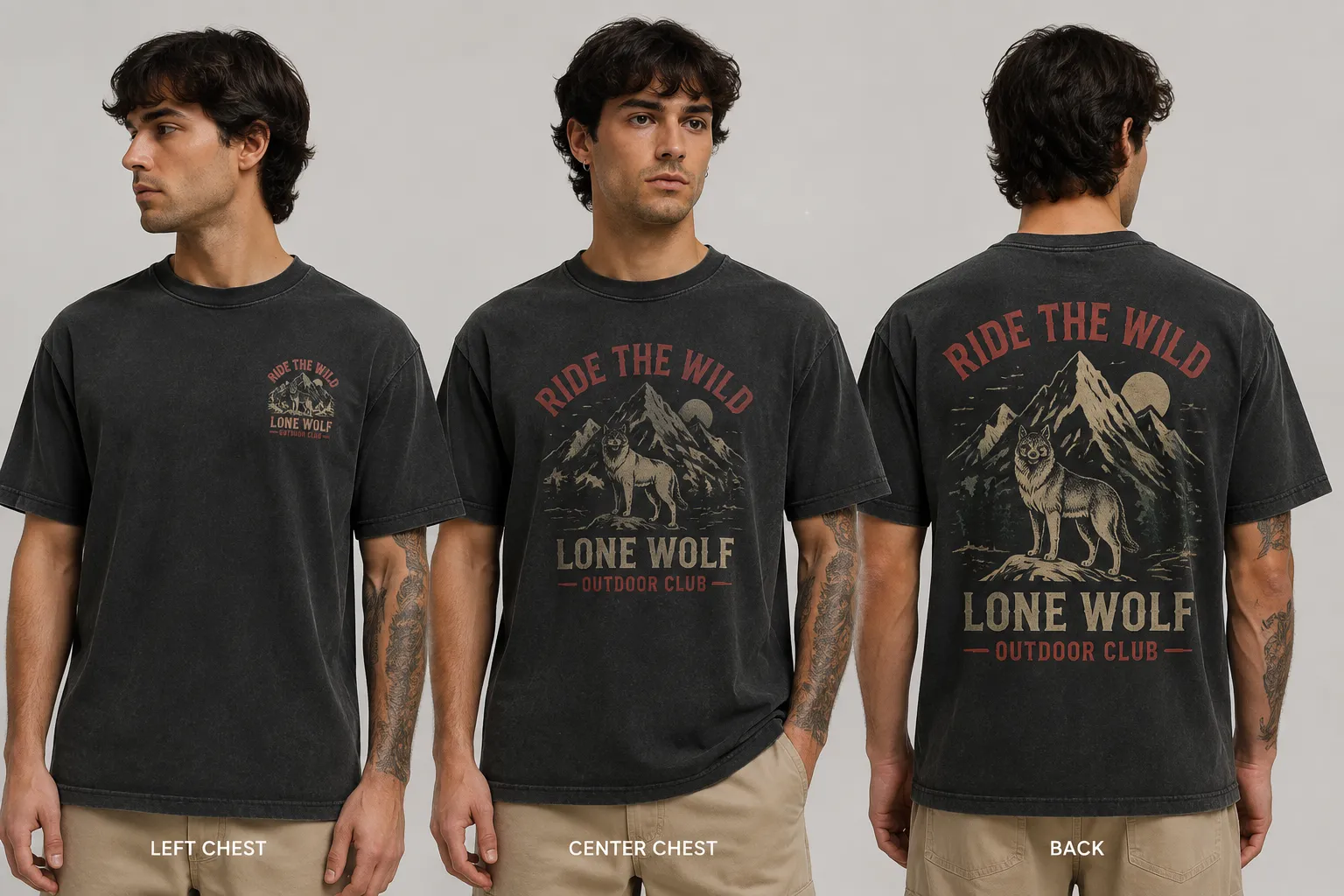
- Left chest: often functions as a compact identifier or secondary mark. Review its relationship to the collar, artwork width, smallest garment, and reduced listing frame.
- Center chest: gives the artwork more front-facing priority. Check visual breathing room above and below the graphic rather than judging its outer dimensions alone.
- Full front: provides more room for a primary composition, but a design that suits a boxy adult shirt may crowd a fitted shirt or a smaller size.
- Upper back or full back: can carry a larger graphic or several information layers. Compare collar distance, text size, line weight, and the relationship between front and back.
- Sleeve or nape: usually serves as a supporting mark. Review sleeve width, orientation when worn, seam distance, smallest detail, and visibility in a front-facing listing image.
- Hemline or inside neck: has a distinct visibility and construction context. Do not treat either area as a shrunken full-front route.
- All-over: requires its own template and review path. A localized mockup cannot answer repeat behavior, artwork boundaries, or all-over production questions.
A collar offset should be recorded as a draft comparison field. The appropriate position can change with artwork geometry, collar construction, garment size, and the current provider template. The distance from the collar is not a universal placement rule.
Review Scale and Print-Area Fit
The useful question is not simply how large the file is. Ask how the graphic occupies this garment at the smallest planned size and intended viewing distance.
- Approximate artwork width, height, and proportion
- Smallest planned garment size
- Smallest text and thinnest line
- Collar and seam clearance
- Visual weight on the selected silhouette
- Crop risk in listing and campaign assets
- Artwork resolution and current provider file guidance
- Whether each size group needs a separate scale or crop
The smallest planned garment often reveals scale problems first. Text may become difficult to read, a detailed motif may lose separation, or the graphic may occupy too much of the available panel. Create separate simulated mockups for materially different garment types or size groups, then record any proportional revision as an adaptation rather than quietly resizing the file.
Review the nearest visual element as well as the outer edge of the artwork. Mark the collar or neckline reference, closest artwork element, nearby seam, intended clearance, source of the clearance value, and person responsible for confirmation. A draft measurement is not the same as a provider-approved production value.
Adapt Artwork Across Garment Types
Moving artwork from a T-shirt to a hoodie, sweatshirt, tank, or other apparel form changes the surrounding geometry. The same nominal width does not necessarily create the same visual balance.
| Variable | Question for the review |
|---|---|
| Front panel | Does the width or length change the graphic's apparent scale? |
| Construction | Do a hood, neckline, armhole, pocket, or seam interrupt the intended area? |
| Silhouette | Does the fit alter the graphic's visual weight or breathing room? |
| Secondary marks | Does sleeve width or orientation change how the mark is seen when worn? |
| Production area | Does the current garment-specific provider template support the planned route? |
| Presentation | Will listing and campaign imagery show the same relationship to the garment? |
For each garment, decide whether the concept needs a revised scale, cropped composition, simplified detail, different placement route, or alternate artwork version. One T-shirt mockup is not evidence for every garment in the collection.
Plan Garment and Artwork Colorways Together
Colorway planning has two connected parts: garment tone and artwork palette. Review them as a pair, especially when the graphic contains small text or fine lines.
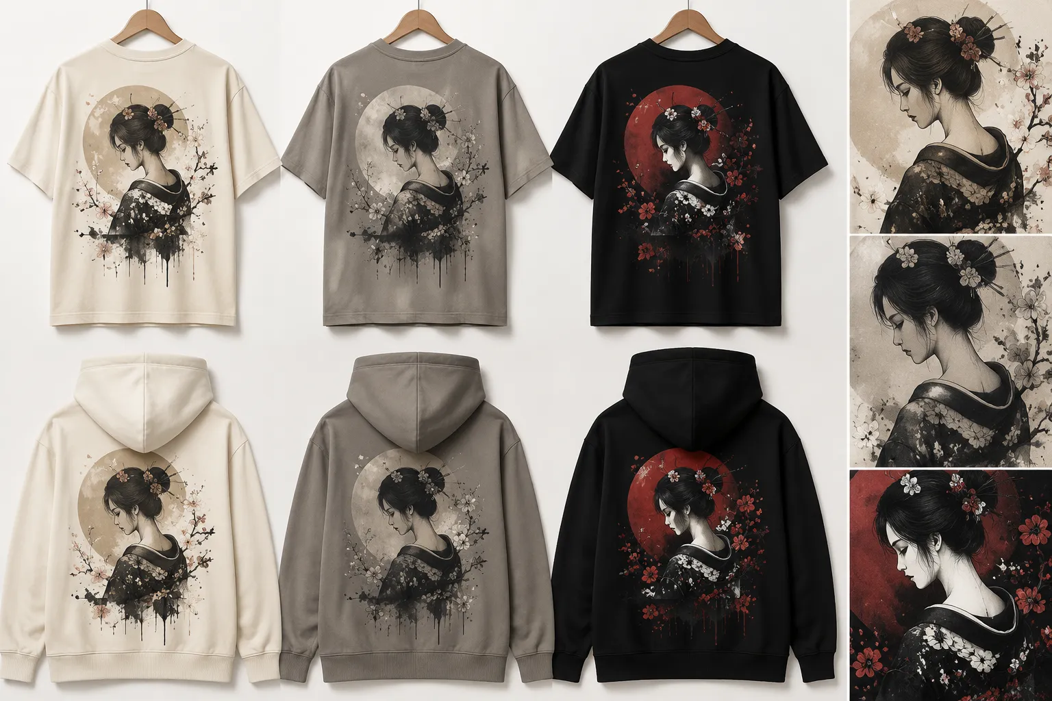
- Garment tone and artwork colorway
- Contrast of the smallest meaningful element
- Original, reversed, reduced, or alternate artwork version
- Consistency with the wider collection
- Whether the relationship has only been viewed on screen or examined on fabric
Dark artwork on a dark garment and light artwork on a light garment can both lose separation. The larger motif may still read while fine text disappears. Prepare a reversed or adjusted version when the collection requires the same concept across multiple garment tones.
Color shown in a design application or simulated mockup remains a digital comparison. Textile construction, substrate, print process, treatment, and other production variables can affect the result. Research on textile color evaluation discusses process-dependent variation, but it does not establish one universal outcome for every apparel workflow. A screen comparison is not proof of exact color matching, durability, or final textile appearance.
- Compare digital colorways on the selected garment tone.
- Check the current provider or printer guidance.
- Record unresolved color-management or artwork questions.
- Request a physical sample when fabric interaction, shade accuracy, wash behavior, or print method matters.
- Record what was observed and what remains unconfirmed.
Use One Review Matrix
A placement and colorway review matrix keeps variants comparable. Each row should describe one named combination, using the same garment, audience, and launch context wherever a direct comparison is intended.
| Field | Record |
|---|---|
| Garment area | Placement route and relevant construction feature |
| Intended role | Primary graphic, supporting mark, identifier, or accent |
| Approximate scale | Draft width, height, proportion, and size group |
| Garment type and tone | Selected form and fabric color or tone |
| Artwork colorway | Original, reversed, reduced, or alternate palette |
| Collar and seam relationship | Nearest construction feature and planned clearance |
| Viewing context | Worn view, listing frame, thumbnail, campaign crop, or flat view |
| Asset state | Intended, simulated, template-checked, sampled, approved, or produced |
| Confirmation owner | Provider, printer, designer, or internal reviewer |
| Next decision | Revise, compare, confirm, sample, approve, or hold |
Keep open questions in the same record: whether the provider allows the planned area, whether the smallest size needs a separate scale, whether a sleeve leaves enough room after seam clearance, whether a dark-garment version is needed, and whether the color decision depends on a physical sample.
Separate Mockups from Listing and Campaign Assets
A mockup placement review addresses visible balance, apparent scale, crop, garment tone, front-to-back relationship, and small-mark visibility. A production check asks different questions. Keep presentation assets separate from production assets because a listing frame may crop the garment differently from a campaign image.
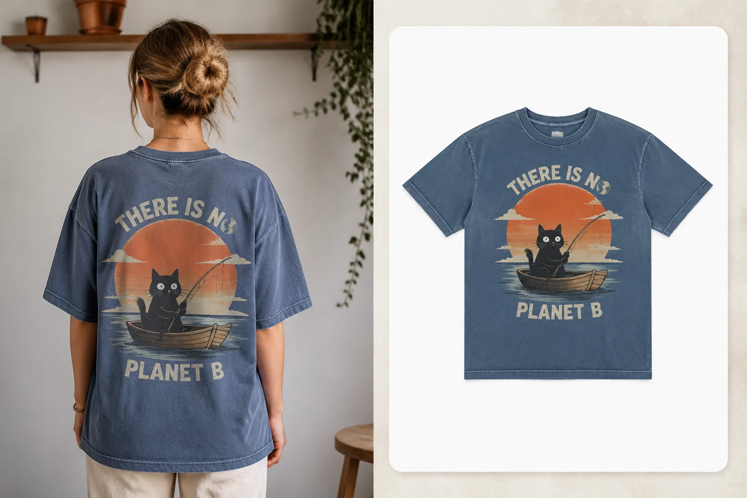
- Simulated mockup: compare placement, proportion, tone, and visual hierarchy.
- Listing frame: check thumbnail presence, crop, and the information visible at reduced size.
- Campaign asset: check the intended crop and whether secondary placements remain visible or intentionally recede.
- Provider template: check the current garment-specific production area and file requirements.
- Physical sample: examine fabric interaction, seams, actual color, and print behavior.
Digital apparel visualization can help a team communicate decisions about color, print scale, and proportion. Its value depends on the garment representation and the question being asked. Physical fabric and production behavior still require external confirmation or sampling when they affect the decision.
Diagnose the Visible Failure
When a design feels wrong, describe the visible failure before changing the artwork. The next revision should address the observed relationship.
| Visible issue | Review first | Likely next action |
|---|---|---|
| The graphic feels crowded | Collar offset, nearest artwork element, seam, size, and cut | Revise position or scale and record the new comparison |
| The graphic overwhelms the garment | Visual weight across fitted, relaxed, and boxy silhouettes | Test a proportional revision instead of one fixed dimension |
| Small text disappears | Smallest garment, viewing distance, crop, line weight, and tone | Revise the artwork or mark the issue for provider confirmation |
| The colorway loses separation | Garment tone, artwork version, and smallest detail | Prepare a reversed or adjusted colorway for review |
| The set feels inconsistent | Placement role, scale, geometry, and repeated color relationships | Rebalance the set without treating every secondary mark as a reduced copy |
| The mockup looks right but production is unresolved | Current provider template, printer guidance, and sample requirement | Keep the asset simulated until the responsible evidence is available |
Prepare the Handoff
A useful handoff record names the decision and its present evidence state:
- Garment and size range
- Placement route and intended graphic role
- Approximate scale and collar or seam notes
- Garment tone and artwork colorway
- Viewing contexts reviewed
- Current asset state
- Provider or printer questions
- Physical sample requirement
- Open rights or usage record, when relevant
- Reviewer and next action
Keep rights, marketplace policies, and provider requirements as separate confirmation tracks. A placement decision does not establish permission to use artwork, marketplace acceptance, or production readiness.
Sources
- An Integrated Printed Textile Design and Apparel Product Development Process
- Color Gamut Comparison Methodology and Evaluation for Textile Inkjet Printing
- Color Accuracy and Durability for Printed, Branded Textiles
- Exploring the Use of 3D Apparel Visualization Software to Fit Garments for People with Disabilities